‘HER’
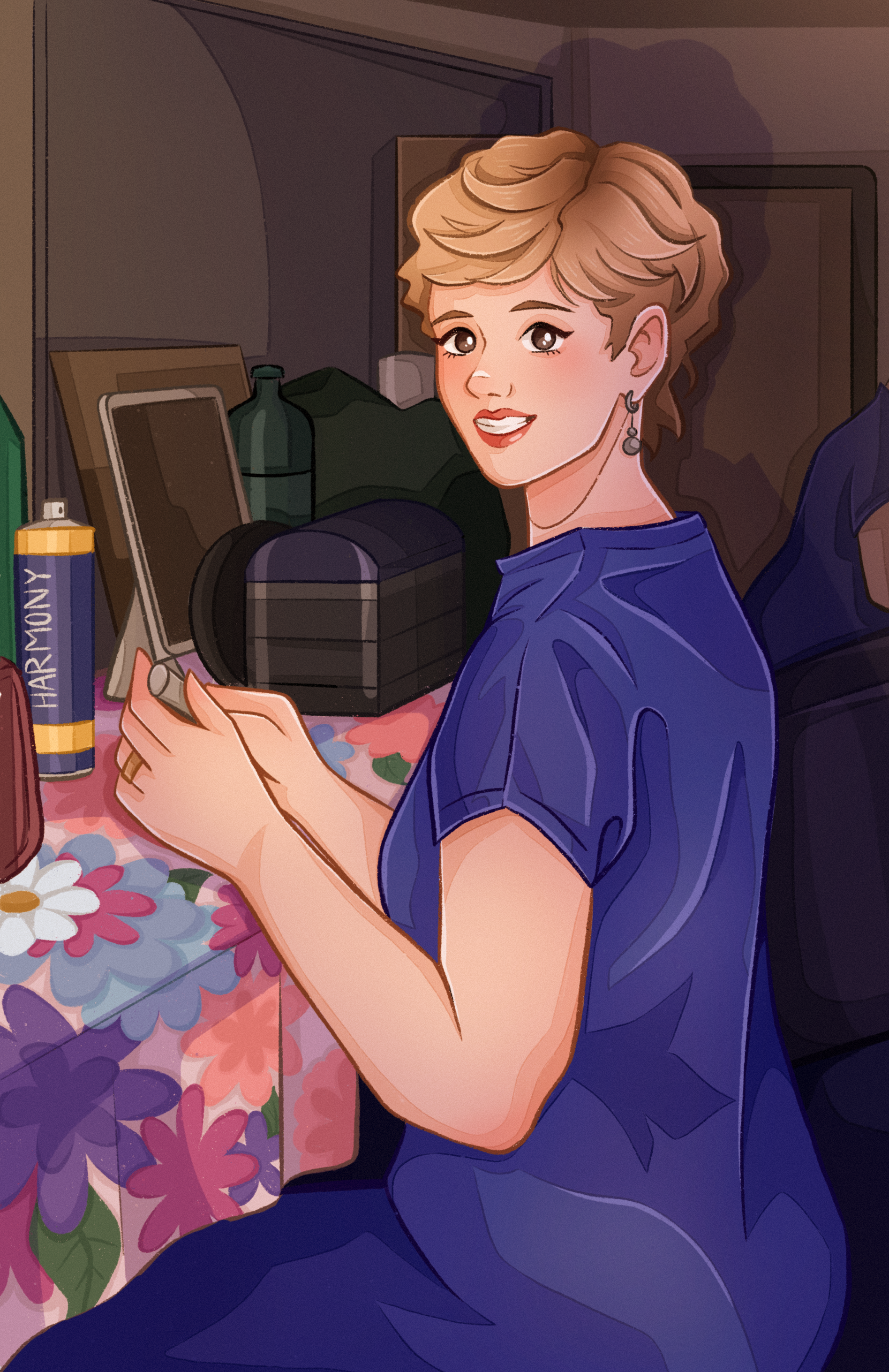
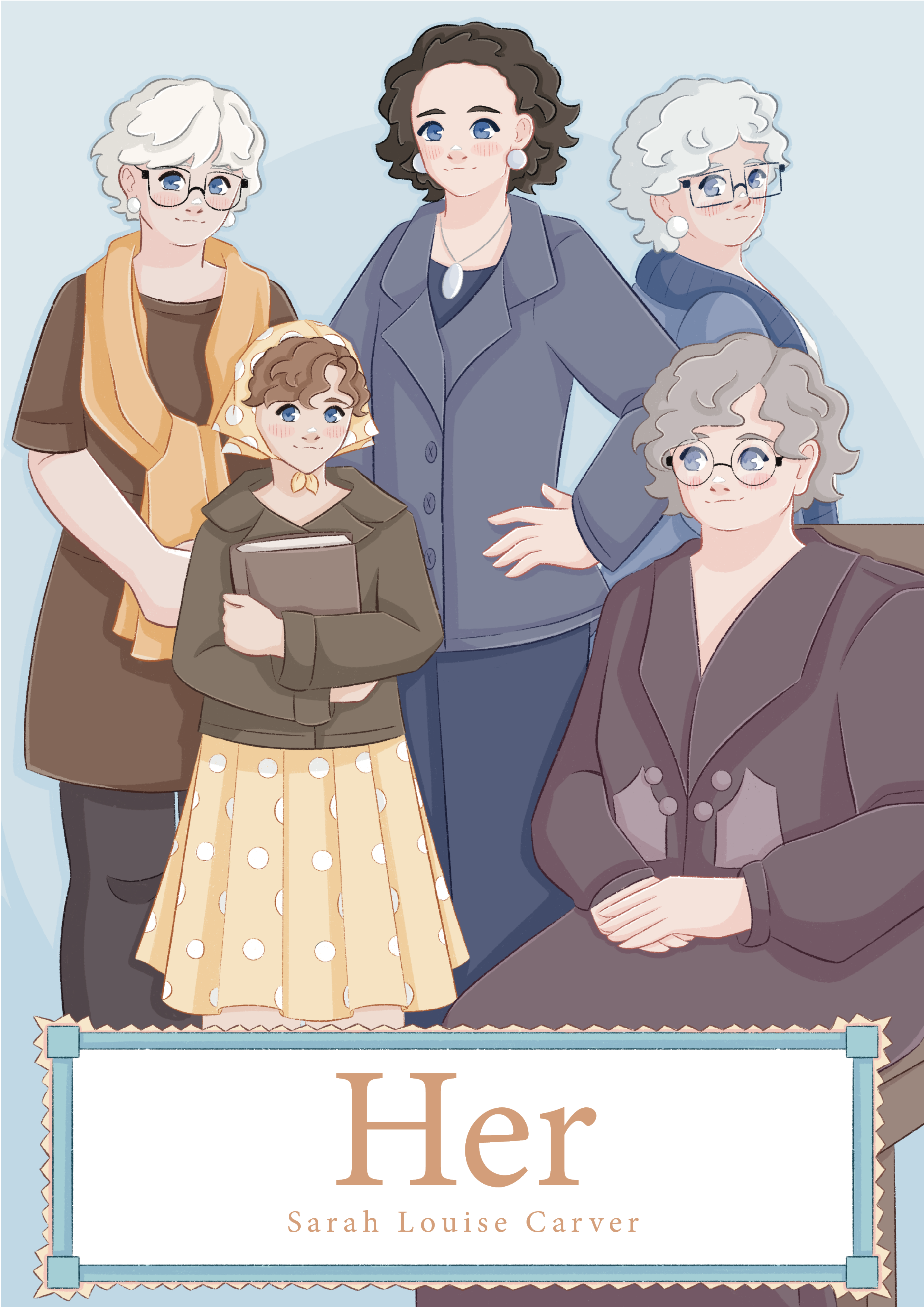
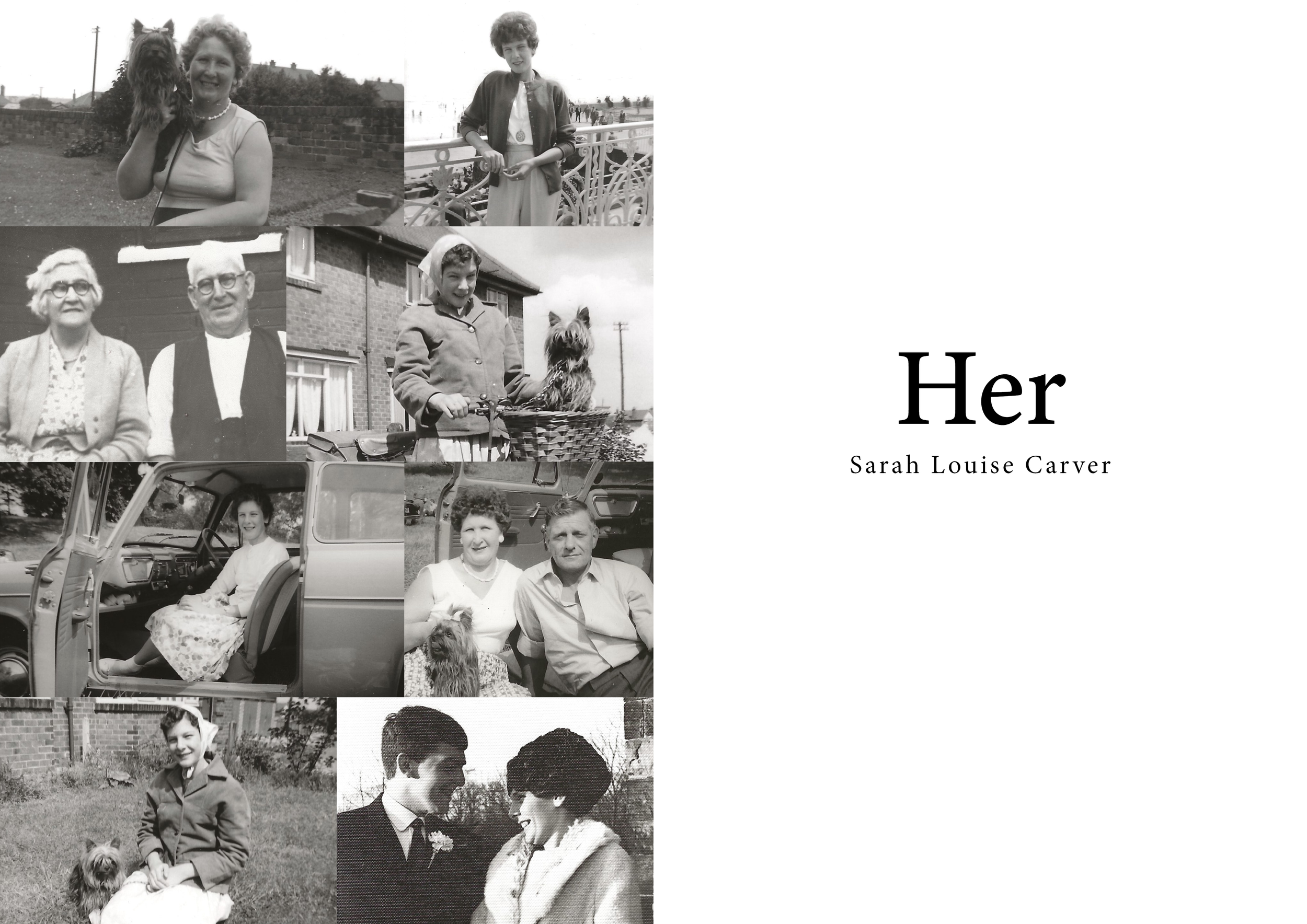
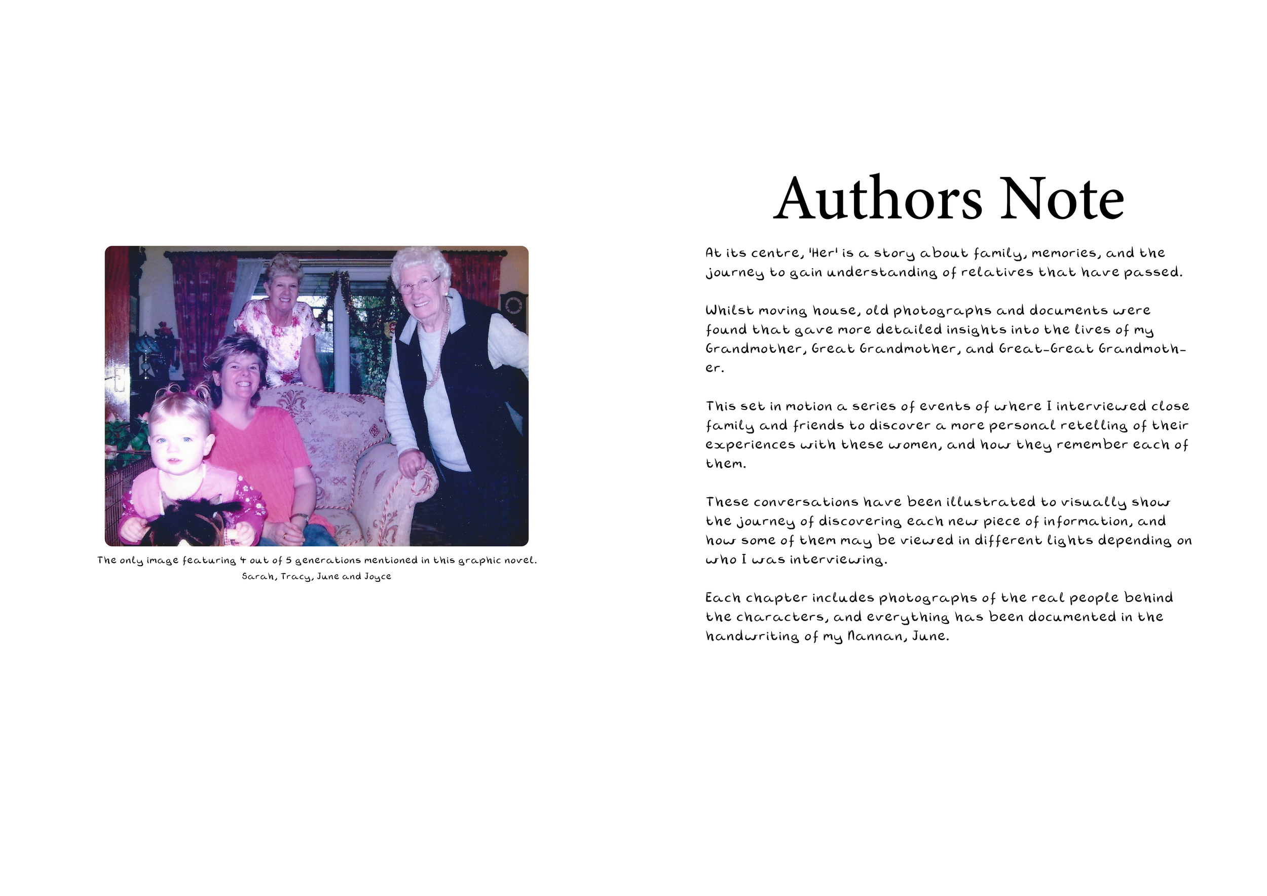
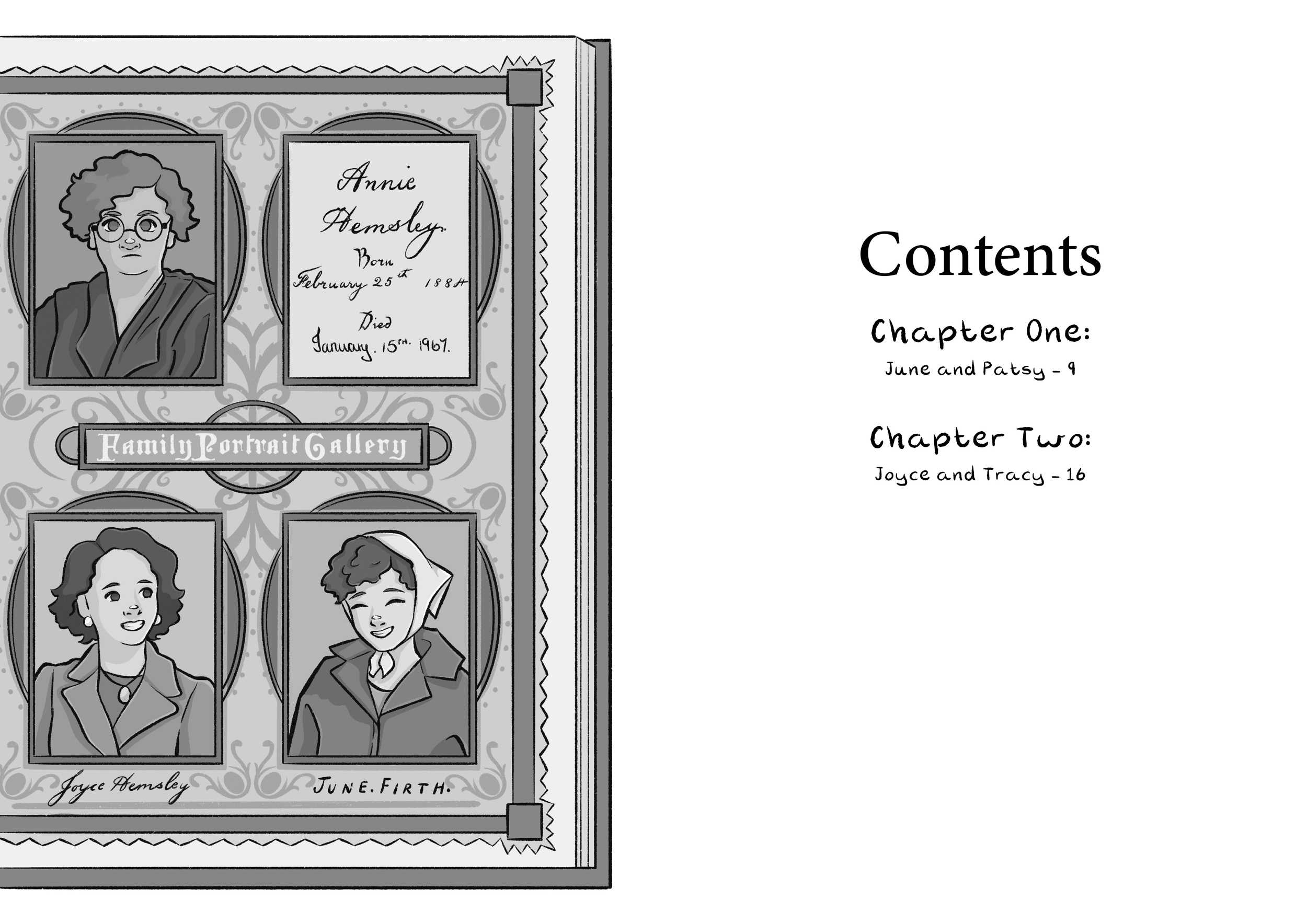
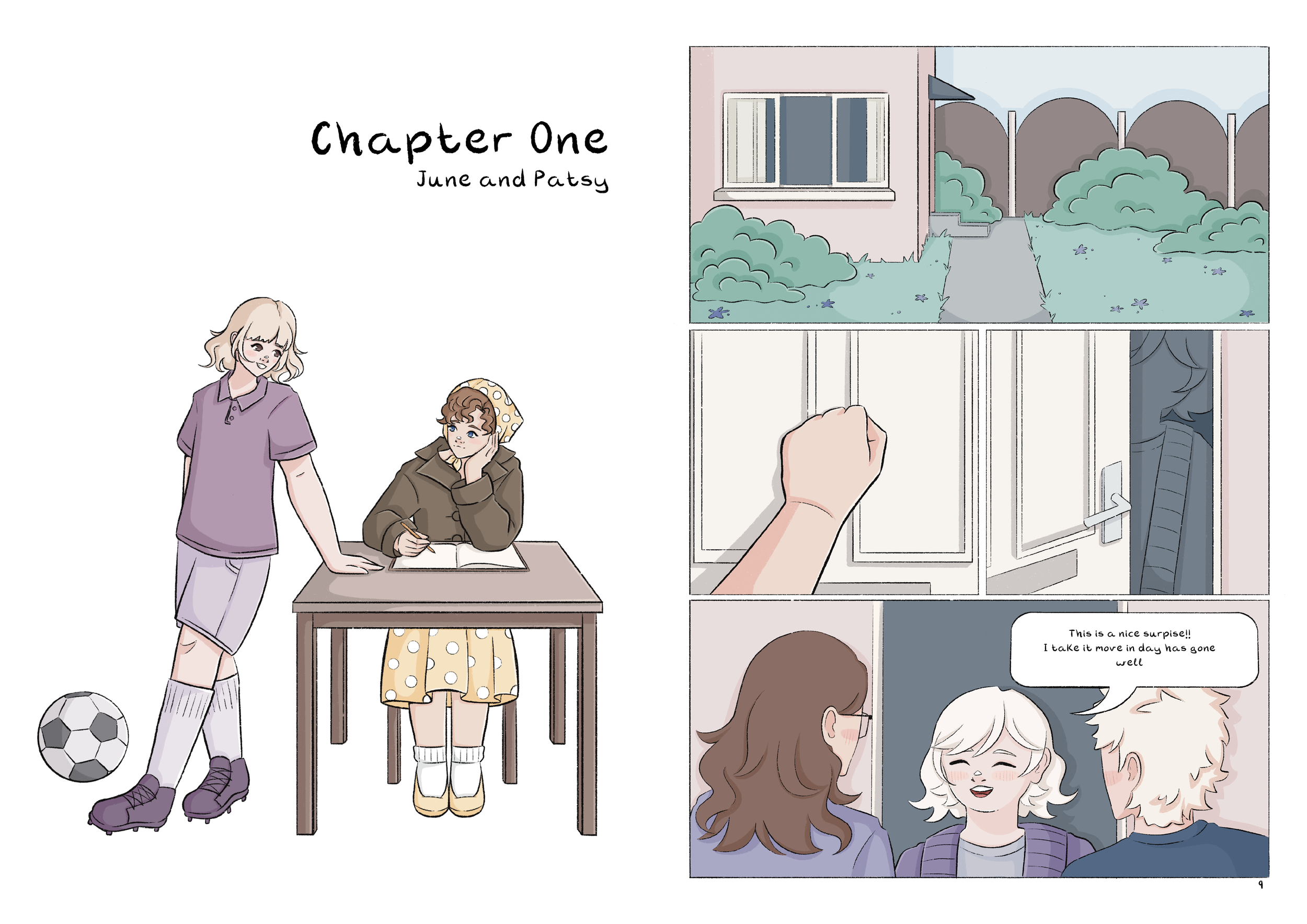
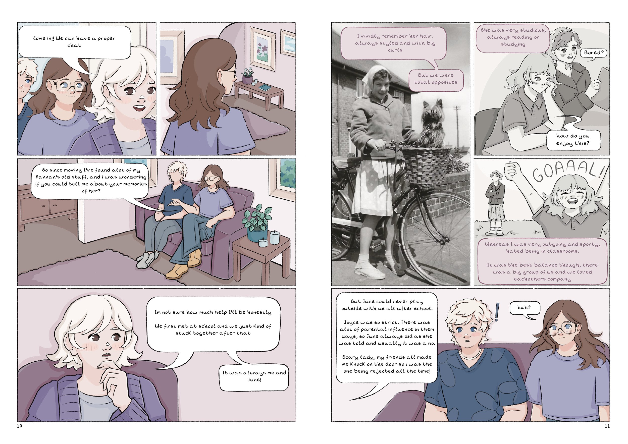
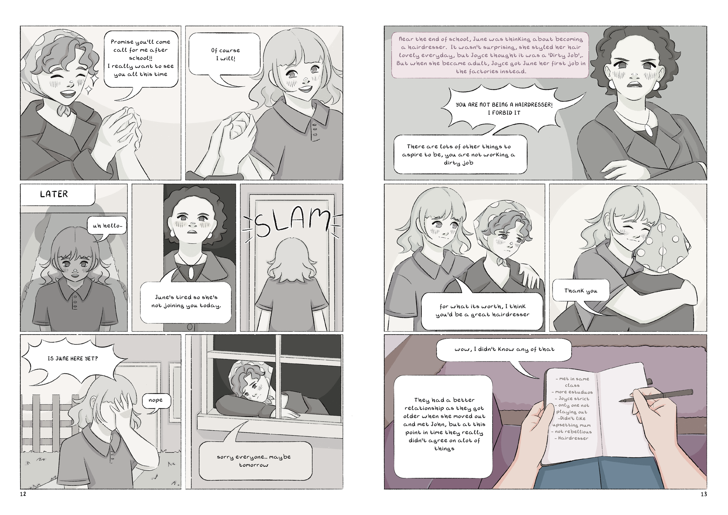
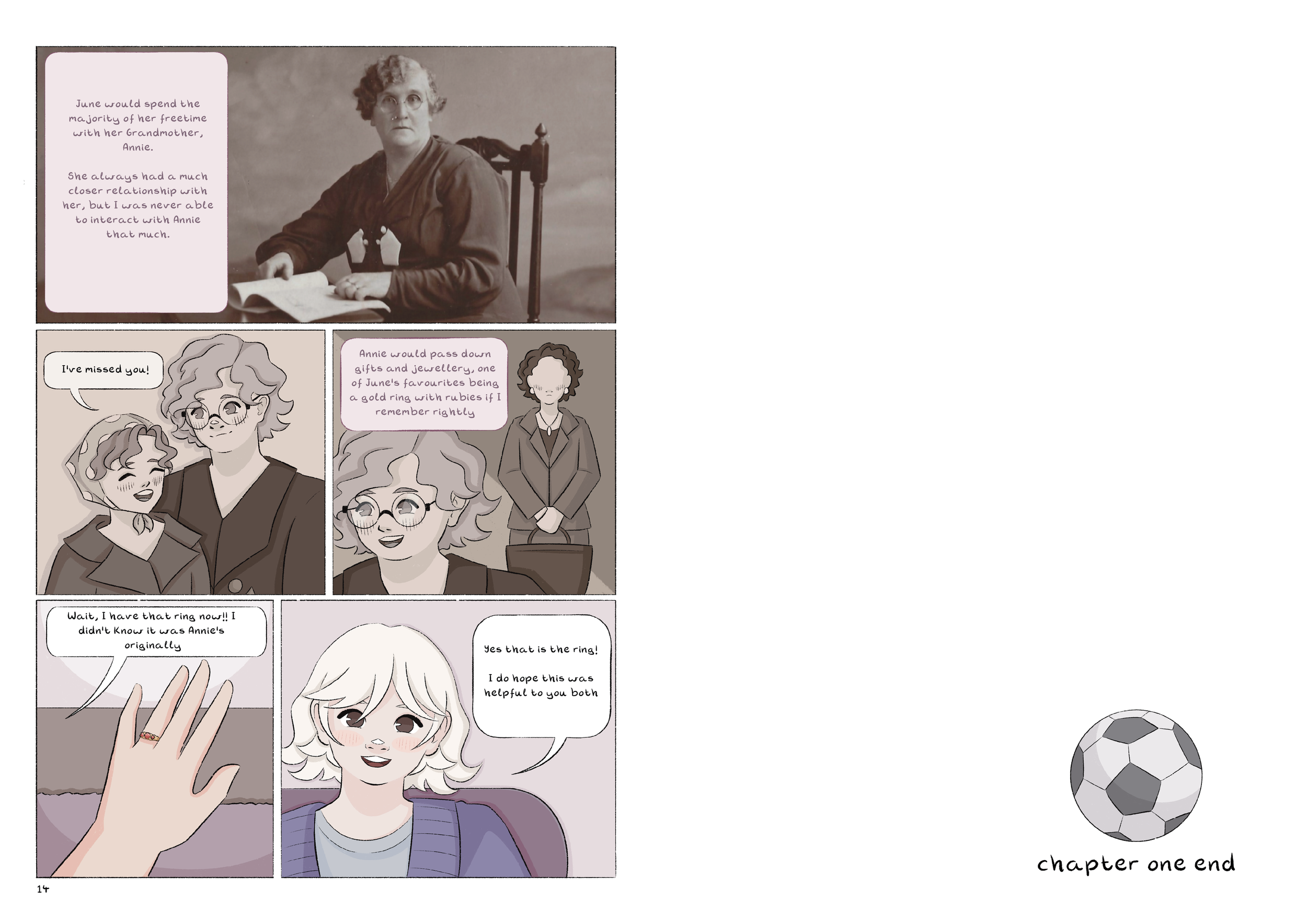
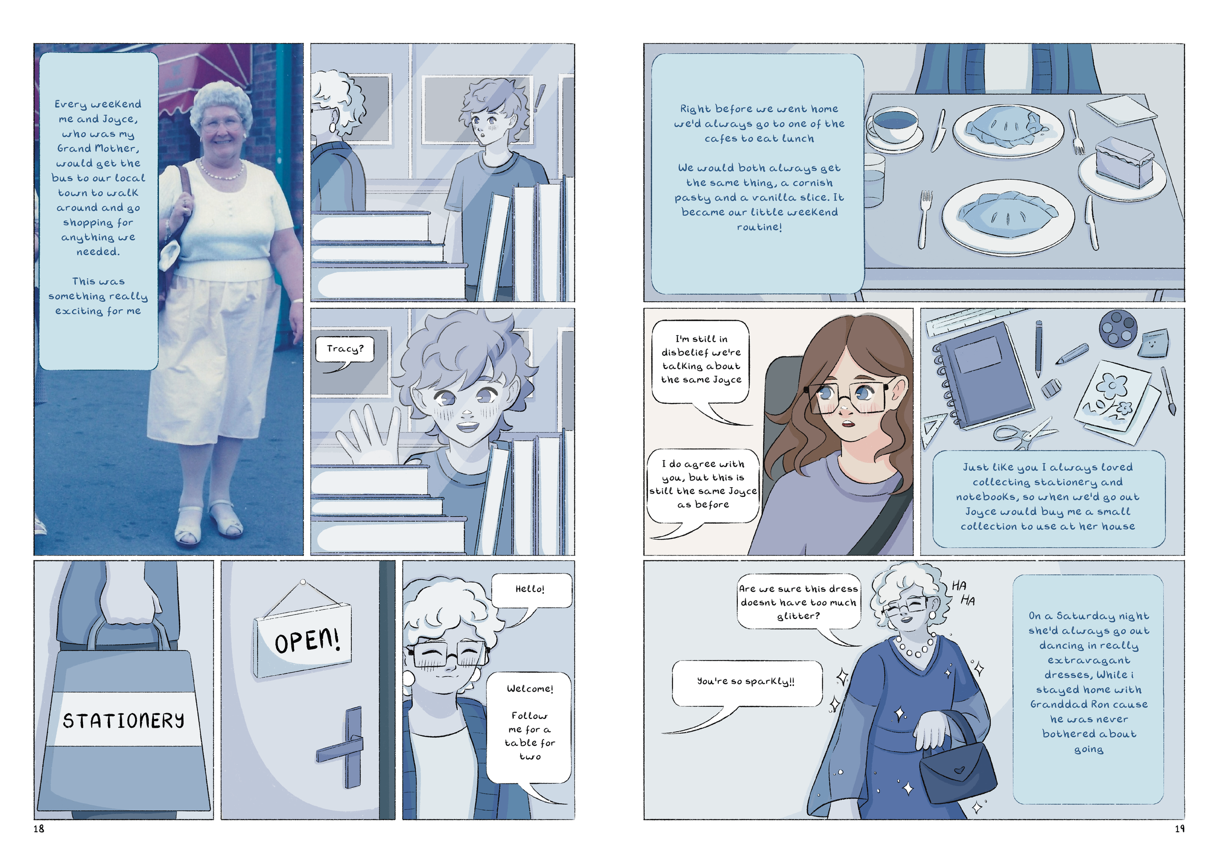
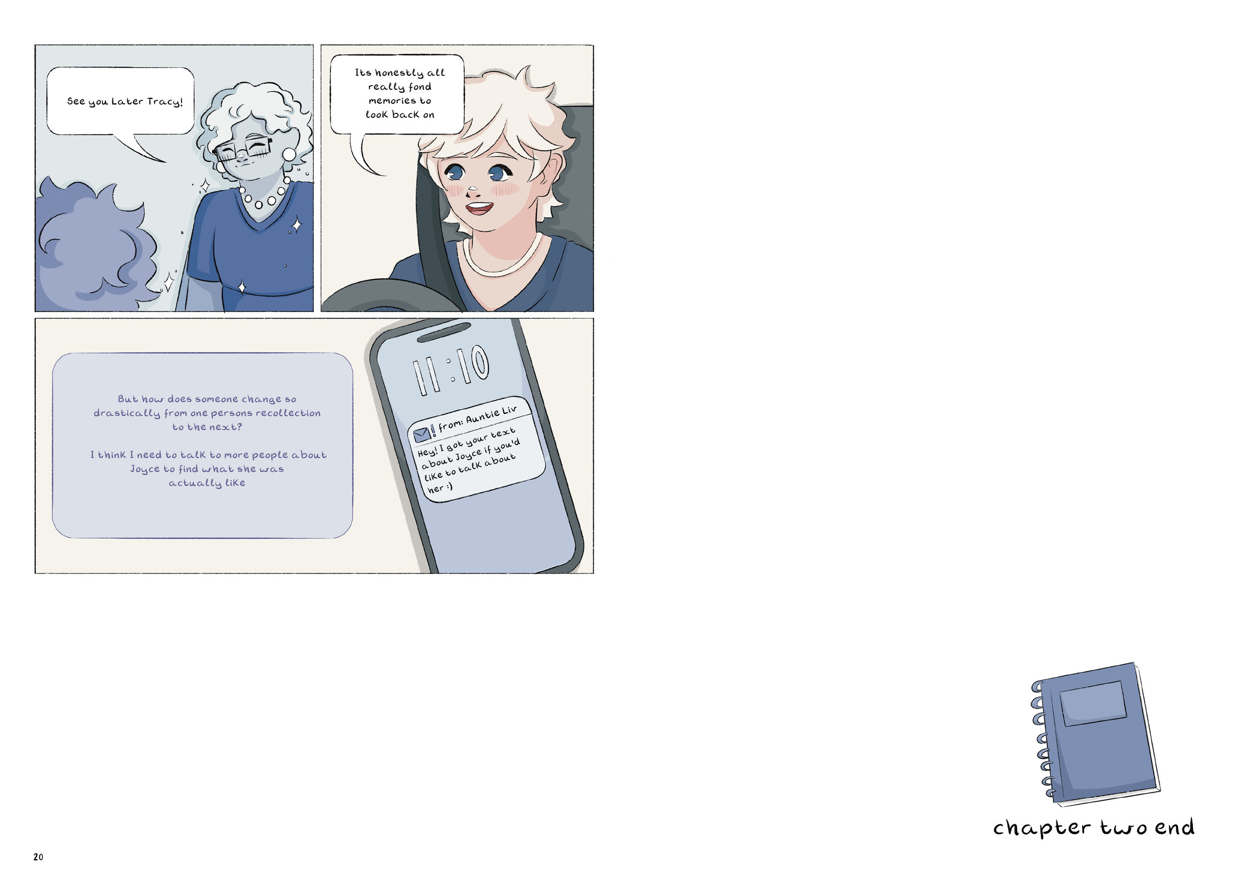
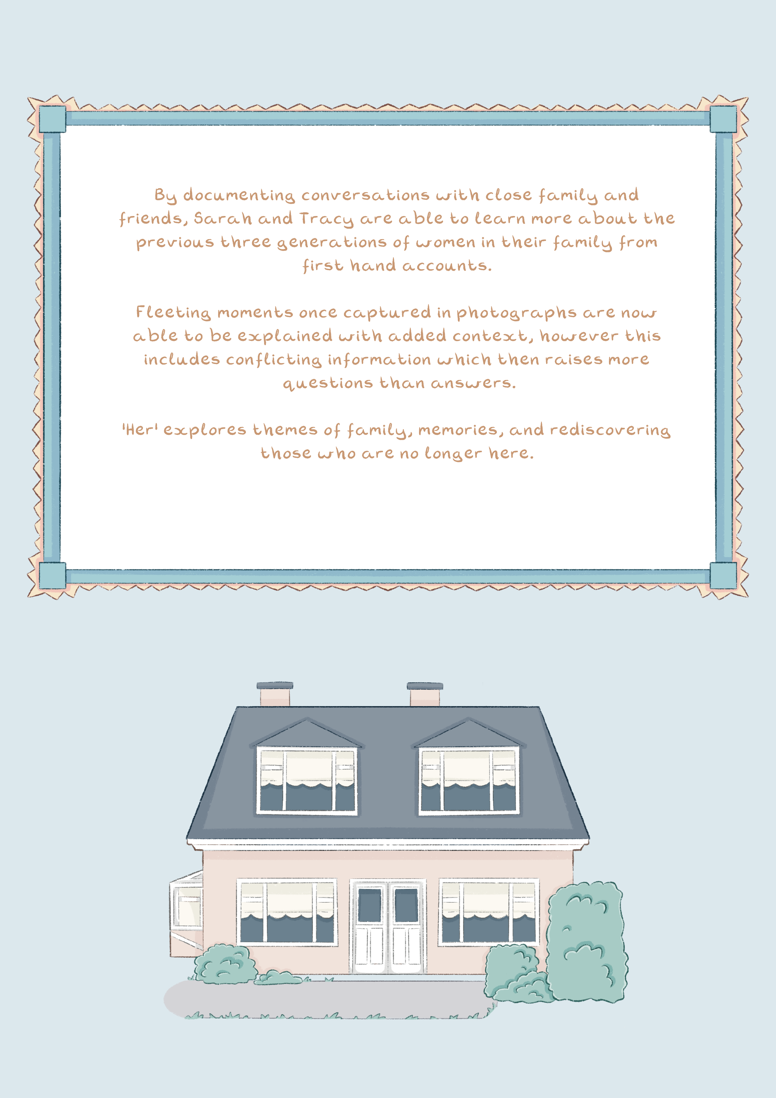
‘Her’ is a graphic novel about memories, and the journey to rediscover passed family members through conversations with those close to them. This is based on the real lives of my own family, June, Joyce and Annie.
Throughout this, it is revealed that the memories shared conflict the version of these women that Sarah and Tracy had, and how they deal with the initial reactions of this. The contrasting recounts of how each women acted when they were younger, compared to when they got older explores how people can change over the years, but you are remembered by others during the small window of time that they knew you.
Self Directed Project - Role: Illustrator and Author
CHARACTER DEVELOPMENT
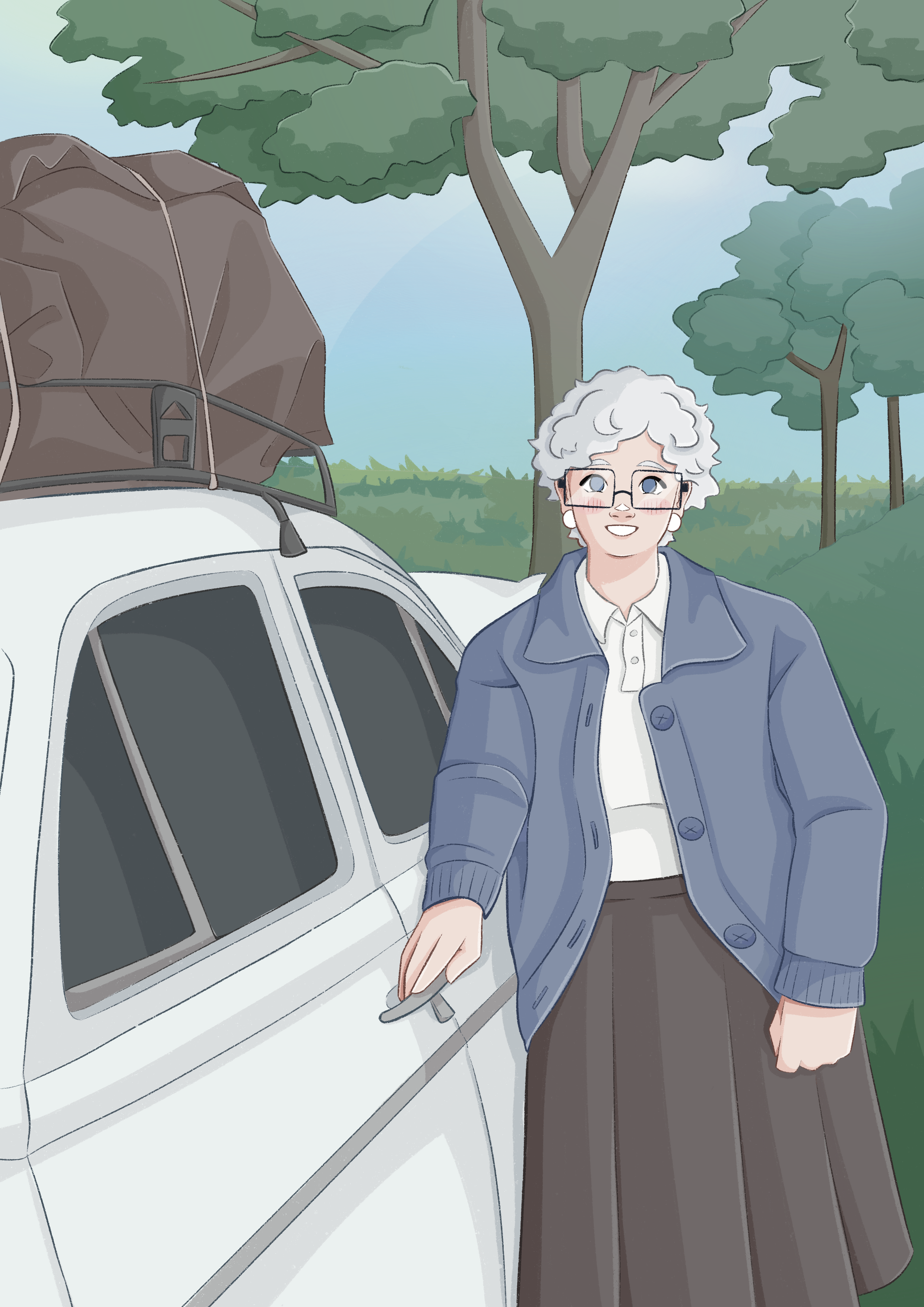
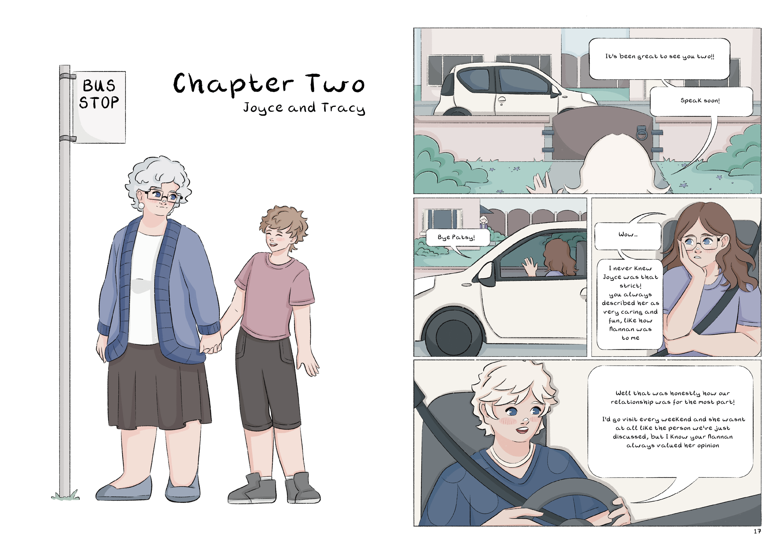
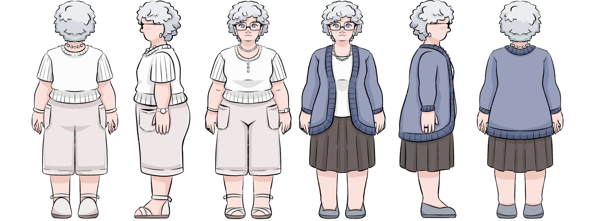
Joyce is the middle generation in ‘Her’, and due to this she is remembered in a variety of ways by different interviewees. The white outfit is created to be angular and boxy, to suggest how she dominated the space with full control over the family.
However, the second outfit features a blue cardigan that contains much softer and gentler shapes. This is to reflect her time as a grandmother, where her attitude shifted, still respected but much kinder and peaceful. Even though it is the same person, these two characters did not exist in the same time period, and people firmly remember her as one or the other, never both.
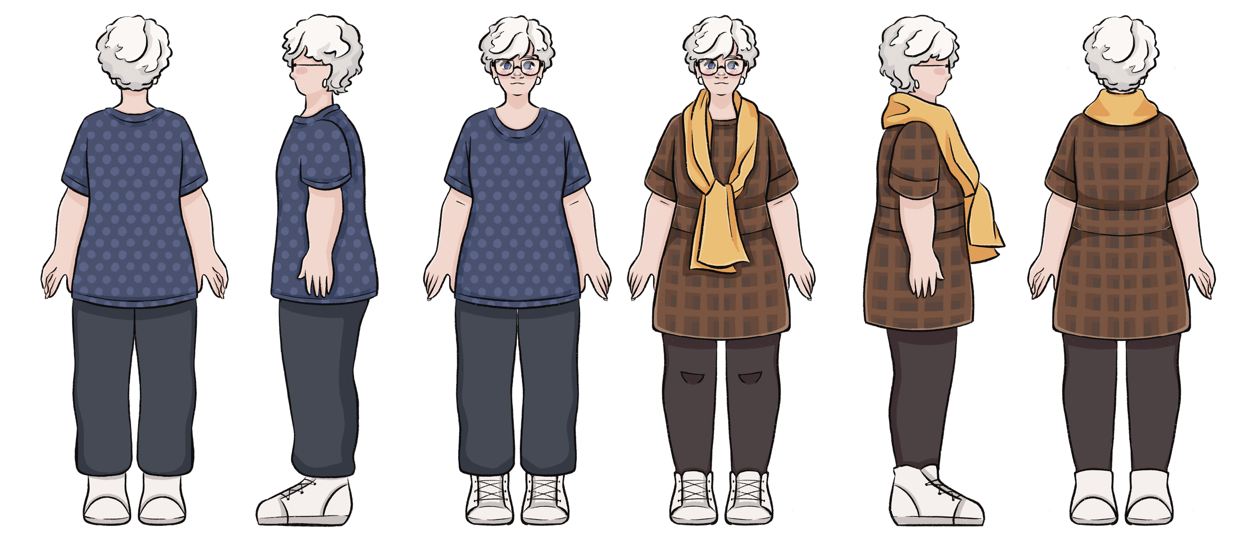
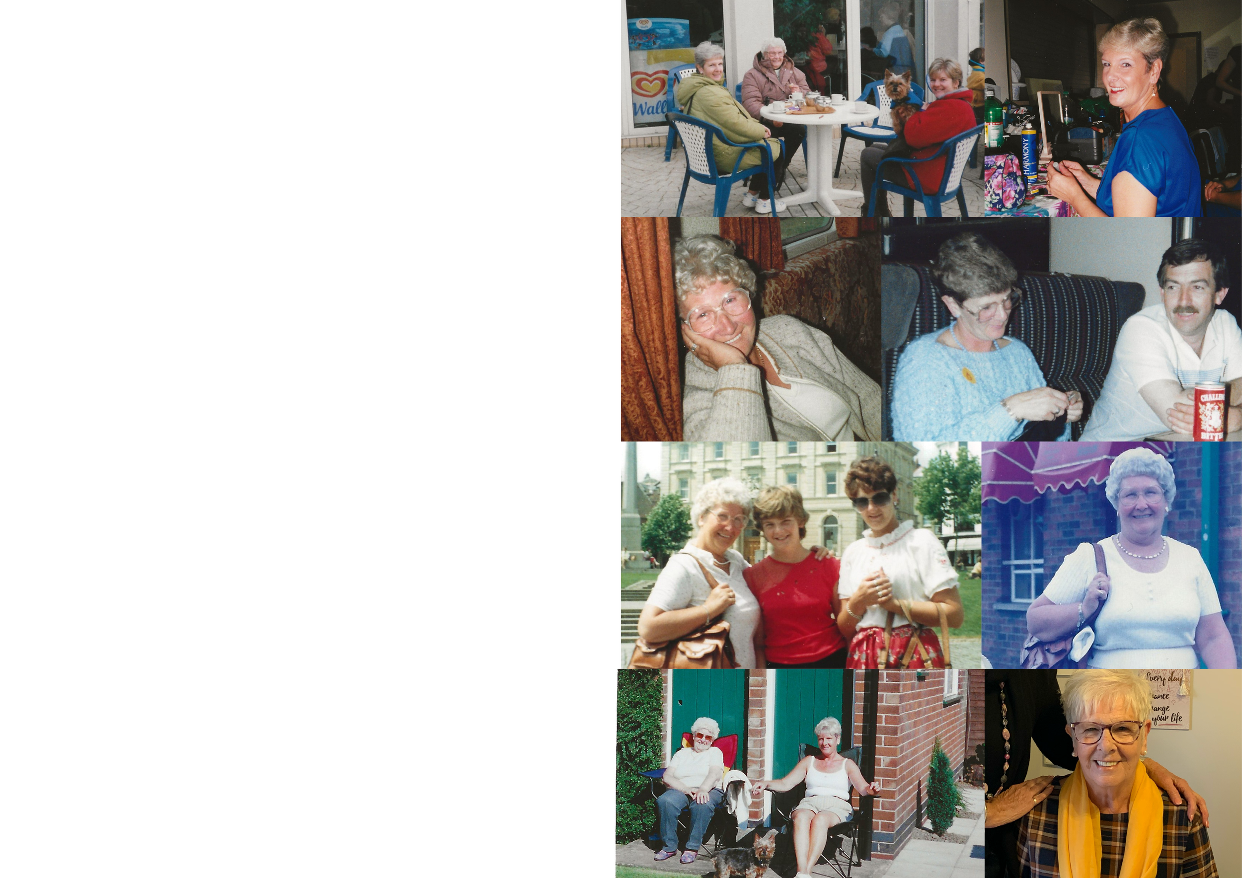
June on the other hand, is described as the more welcoming and optimistic member of the family, so I selected the yellow scarf design to visually contrast with Joyce by using a warmer colour palette, to challenge her more muted, cool design.
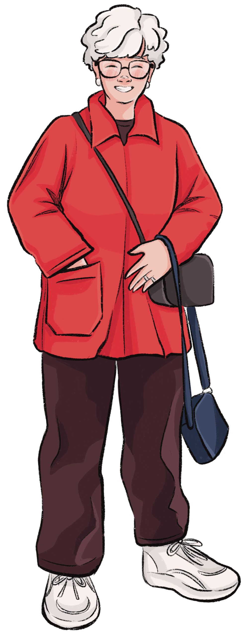
It was also important to replicate the subtle yet glamorous way she used to dress, whilst also making links to the appearance of her younger self. I first studied the outfits featured in photographs from the correct time period (Such as the red coat) and noted the most important elements, which are the longer shirts, and tight jeans or leggings.